Sketching
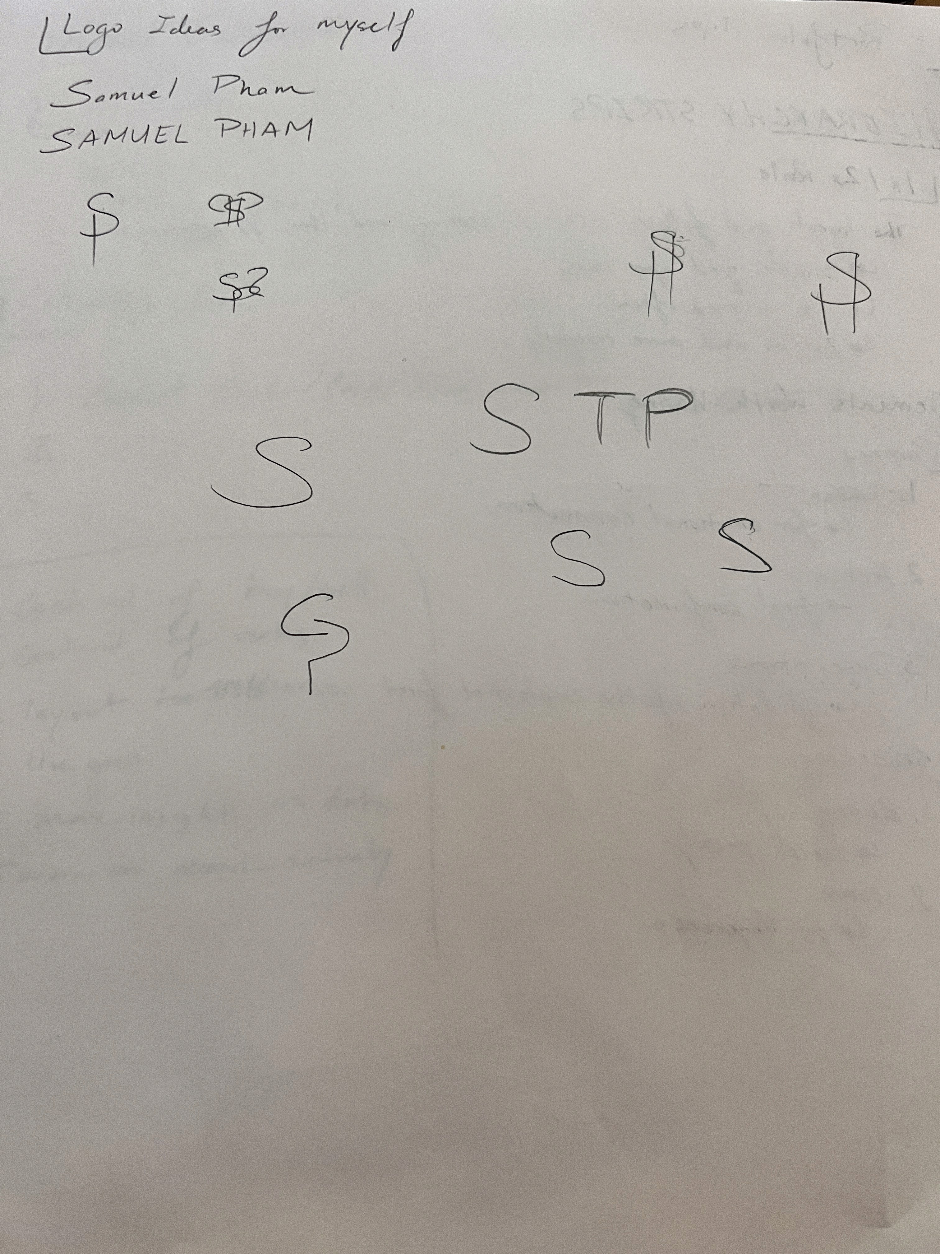
Here are some first draft sketching on what would become my logo, you can see that I wanted to integrate the "S" and "P" together into one form

Iteration 1
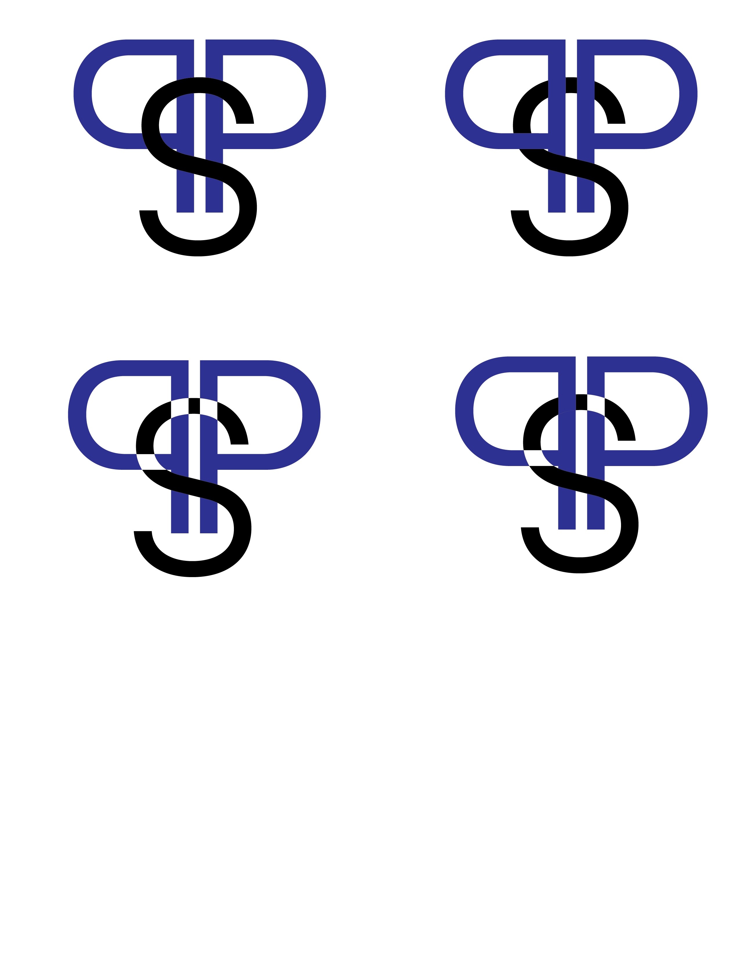
For the first iteration I was messing around with mirroring one of the letters and the letter "P" seemed right because of the symmetry. I also came upon the colors for simplicity and clean feel.

Iteration 2
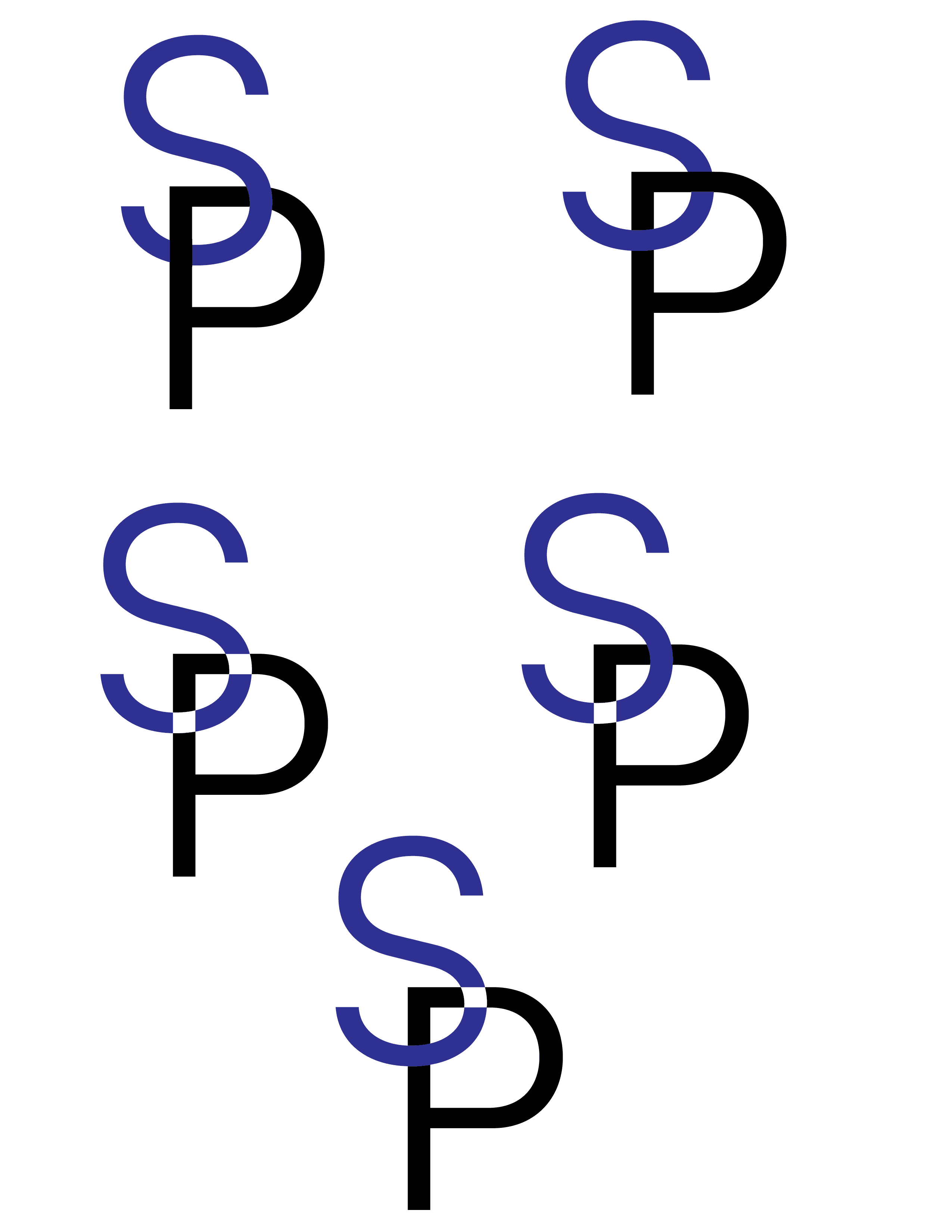
For the second Iteration I turned to a more simplified version of iteration 1. I still stuck with the integration of the letters, I wanted to make the "S" to be a hook for the "P" however I have yet to fully depict it.

