Sketching
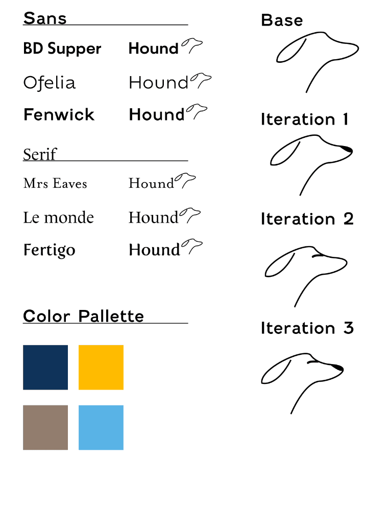
Here I was exploring typefaces along with color and the logo for Hound. For the font I was already thinking of san serif, however I still thought of giving serif a shot. For the logo I wanted it to keep it abstract but not too much to a point where the user wouldn't see any cohesion. The colors I chose were to keep that corporate feel but somehow playful.

Iteration 1
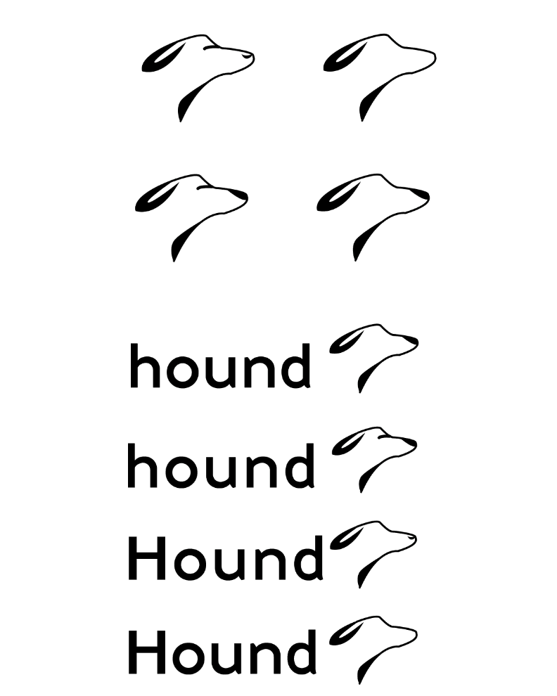
Here can see that I started to thicken some line weights and put more emphasis on the ear and neck area. Still keeping it abstract but keep a balance in visual weight. I came down to the solution of using "Fenwick" as I found it to a better flow to the logo.

